10,000 search results
(0.031 seconds)
- Eurostile Next by Linotype,
$50.99 Eurostile Next is Linotype's redrawn and expanded version of Aldo Novarese's 1962 design. This new version refers back to the original metal types and to its mid-century modern aesthetic of squarish characters and subtle curves. Eurostile Next brings back the gentle curves, which were lost in other digital versions, therefore regaining the spirit of the original design and its somewhat softer demeanor. The family has been greatly expanded, now consisting of five different weights: ultra light, light, regular, semibold, and bold. Along with the regular width, all weights also have extended and condensed versions. Stylistically, Eurostile Next is well suited for designs in the fashion of the 50's and 60's, yet it still has a remarkably new and contemporary feeling. Its numerous variations and typographic features are invaluable for projects ranging from extensive corporate branding to one-off posters and from large signage to small print text.
 - Eurostile by URW Type Foundry,
$89.99 Eurostile Display Caps The Eurostile font family was designed (by Novarese and Butti in 1952) to complement the titling font, Microgramma, by offering a lowercase alphabet. Issued by the Nebiolo foundry, the rather square sans serif Eurostile became popular for display and advertising use. The linear nature of Eurostile suggests modern architecture, and its attraction is technical and functional. Eurostile is commonly misspelled Eurostyle.
 - Eurostile by Mecanorma Collection,
$45.00 - Eurostile Next Paneuropean by Linotype,
$50.99Eurostile Next is Linotype's redrawn and expanded version of Aldo Novarese's 1962 design. This new version refers back to the original metal types and to its mid-century modern aesthetic of squarish characters and subtle curves. Eurostile Next brings back the gentle curves, which were lost in other digital versions, therefore regaining the spirit of the original design and its somewhat softer demeanor. The family has been greatly expanded, now consisting of five different weights: ultra light, light, regular, semibold, and bold. Along with the regular width, all weights also have extended and condensed versions. Stylistically, Eurostile Next is well suited for designs in the fashion of the 50's and 60's, yet it still has a remarkably new and contemporary feeling. Its numerous variations and typographic features are invaluable for projects ranging from extensive corporate branding to one-off posters and from large signage to small print text. - Eurostile SH by Scangraphic Digital Type Collection,
$26.00 Since the release of these fonts most typefaces in the Scangraphic Type Collection appear in two versions. One is designed specifically for headline typesetting (SH: Scangraphic Headline Types) and one specifically for text typesetting (SB Scangraphic Bodytypes). The most obvious differentiation can be found in the spacing. That of the Bodytypes is adjusted for readability. That of the Headline Types is decidedly more narrow in order to do justice to the requirements of headline typesetting. The kerning tables, as well, have been individualized for each of these type varieties. In addition to the adjustment of spacing, there are also adjustments in the design. For the Bodytypes, fine spaces were created which prevented the smear effect on acute angles in small typesizes. For a number of Bodytypes, hairlines and serifs were thickened or the whole typeface was adjusted to meet the optical requirements for setting type in small sizes. For the German lower-case diacritical marks, all Headline Types complements contain alternative integrated accents which allow the compact setting of lower-case headlines.
 - Eurostile LT by Linotype,
$40.99Eurostile® is one of the most important designs from the Italian font designer Aldo Novarese. It was originally produced in 1962 by the Nebiolo foundry as a more complete version of the earlier Microgramma, a caps-only font designed by Novarese and A. Butti. Eurostile reflects the flavor and spirit of the 1950s and 1960s. It has big, squarish shapes with rounded corners that look like television sets from that era. Eurostile has sustained the ability to give text a dynamic, technological aura. It works well for headlines and small bodies of text. The Eurostile font family has 11 weights, from roman to bold and condensed to extended. In 2009 Linotype released a revised version in the Platinum Collection under the name , with three weights in all three different styles. And additionaly there are now new weights for the Eurostile family as , and ." - Eurostile Unicase by Linotype,
$29.99 Akira Kobayashi modified his Eurostile Next design into a fun unicase version. Ascenders and descenders have been traded in for alternates of letters that all share the same height. The effect is similar to using all caps, although this is quite a bit more quirky. For example, letters like the lowercase a and e are now the same height as their capital versions and the lowercase y has been raised to fit between the baseline and top height. Odd relationships such as these give Eurostile Unicase a fresh and funky feeling. Try using it for headlines and titles, then use Eurostile Next for the body text!
 - Eurostile Round by URW Type Foundry,
$89.99 Eurostile, created in 1962 by Aldo Novarese for the Nebbiolo type foundry, is one of the most popular sans serif fonts of all, and has been for about 50 years. Originally designed as a screen font it was very popular from the beginning, even though it is only a slightly modified version of the 10-year-older Microgramma, but completed with lower case characters. On public demand, URW++ has expanded its range of Eurostile with Eurostile Round with 19 additional styles. Quite like Futura Round by URW++, Eurostile Round works perfectly well as webfont.
 - Eurostile Candy by Linotype,
$40.99Eurostile Candy is a fun spinoff from Akira Kobayashi's Eurostile Next family. As the name implies, it is based on Eurostile but with many striking new features. Most obviously, the corners and joints have been rounded off to give it a more friendly and softer feel. On top of those changes, the main skeleton of many characters have been modified. Any extra strokes have been removed - such as in the a, s, or t - and joints have been simplified to create even more square shapes - like in the n and r. With these contemporary and futuristic-styled alterations, Eurostile Candy is a cool new design great for many display projects. - Eurostile SB by Scangraphic Digital Type Collection,
$26.00 Since the release of these fonts most typefaces in the Scangraphic Type Collection appear in two versions. One is designed specifically for headline typesetting (SH: Scangraphic Headline Types) and one specifically for text typesetting (SB Scangraphic Bodytypes). The most obvious differentiation can be found in the spacing. That of the Bodytypes is adjusted for readability. That of the Headline Types is decidedly more narrow in order to do justice to the requirements of headline typesetting. The kerning tables, as well, have been individualized for each of these type varieties. In addition to the adjustment of spacing, there are also adjustments in the design. For the Bodytypes, fine spaces were created which prevented the smear effect on acute angles in small typesizes. For a number of Bodytypes, hairlines and serifs were thickened or the whole typeface was adjusted to meet the optical requirements for setting type in small sizes. For the German lower-case diacritical marks, all Headline Types complements contain alternative integrated accents which allow the compact setting of lower-case headlines.
 - Plasmatica Ext - Unknown license

- Plasmatica Ext - Unknown license

- EXT Unicase by Kevin Thrasher,
$5.00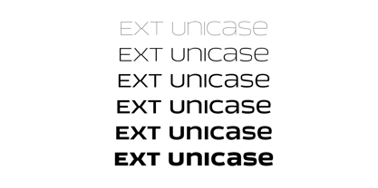
- Labelo Ext by T-26,
$19.00 - Exo - 100% free

- Exit by FSD,
$50.00Exit is my first typeface (designed in 1988). The relationship to Neville Brody's work is evident but with personal touch - Text by Alias Collection,
$60.00 Whereas blackletter types were hand written, Text letterforms are drawn using a series of graphic shapes that slot together in a series of permutations, one set for lower case and another for the upper case. As the link between the method of construction of the letterforms has been removed from the appearance (the quill pen with which they were written resulting in the angle and sharp stresses) there is no logic for these stylistic elements to work in any set way. As this fundamental rule of the blackletter style has been removed the typeface has become something other than a typical or derivative blackletter font.
 - Este by Michael Prewitt,
$20.00 Este is a modern sans serif typeface. The family has 7 weights, ranging from Thin to Bold and is suited for branding, logo, transportation, product design, advertising and packaging. The modern feel is complimented by alternative characters via the OTF stylistic sets.
 - Exited by Sensatype Studio,
$15.00 A Modern Sport Font that perfect for technology, sport, racing, action design project. A new Sans Serif Font that we created special for Headline, Title and more stand out typography needs that will add your variations. It's so perfect to add your style and headline overview. And specially for Headline font, we crafted for futuristic style and modern feels so enjoy to create any project that will show your main idea out. Exited Modern Sport Font ready with: Any options to get creative variations Preview as a inspirations that you can do with Exited font Ready with All Uppercase characters Wish you enjoy our font. :)
 - MTF Jumpin Jack EXT by Miss Tiina Fonts,
$10.00 Jumpin’ Jack Extended is a fun, cartoon-like display font capable of taking any product out of the ordinary! Use it on bold and bright creations such as banners, posters, covers, titles, magazines, etc. This bouncy fun font is a perfect addition to your collection!
 - Slab Four Rounded Ext by Wooden Type Fonts,
$15.00 An original slab serif design inspired by the slab serif designs of the 19th century, with a modern geometric look, bold version, extended.
 - LT Eat - Personal use only

- Neospace Exp - Personal use only

- Nuixyber Next - Personal use only

- AB Exp - 100% free

- Komika Text - Unknown license

- Let's Eat - Unknown license

- Covington Exp - Unknown license

- Next Star - Unknown license

- Exus Pilot - Personal use only

- Covington Exp - Unknown license

- Komika Text - Unknown license

- PanAm Text - Unknown license

- Komika Text - Unknown license

- Komika Text - Unknown license

- Covington Exp - Unknown license

- Next Star - Unknown license

- Covington Exp - Unknown license

- Medici Text - Personal use only

- Alethia Next by Pepper Type,
$40.00 Alethia Next is a grotesque sans-serif typeface with high contrast in all weights. It has been designed to serve as a display typeface in various editorial projects, such as magazines or corporate brochures, as a sans-serif pair to serif types of modern style. Alethia Next comes in 7 weights + matching italics and upright italics, each supporting numerous Latin-based languages as well as major Cyrillic languages including Bulgarian local forms. It is packed with OpenType features like ligatures, small caps, and numerous alternatives.


Page 1 of 250Next page